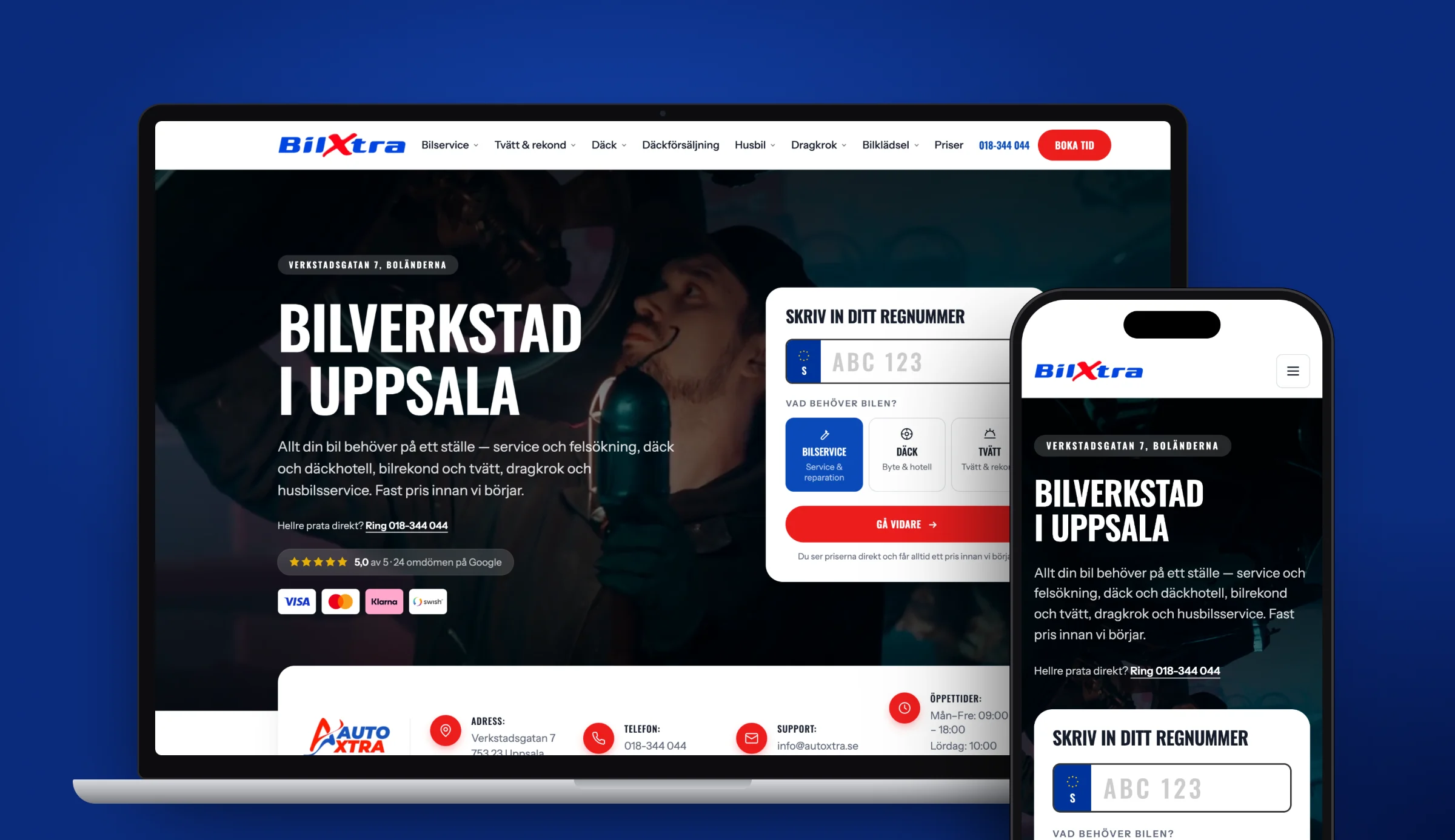
Responsive design means that a website adapts its layout to the screen it is shown on. The same page and the same address work on a phone, a tablet and a large desktop screen. Columns stack on top of each other when space gets narrow, images shrink and the menu changes shape.
So a responsive website is a mobile-friendly website, but the term describes the technique behind it. You do not need a separate mobile version. It is one codebase that reads the screen width and changes the presentation accordingly.
Why mobile sets the terms
For many businesses a large share of visits comes from mobile. It is worth checking the split between devices in your own statistics. People looking for a tradesperson, a hairdresser or an agency often do it with their phone in hand. If the visitor cannot read the text or tap the button, they leave the page and go to the next search result.
Google also looks primarily at the mobile version of your site. More on that further down.
Mobile first
Mobile first is a way of working. You design and code for the smallest screen first and then add more layout as the screen gets larger.
It forces you to prioritise. On a phone screen only the most important things fit at the top, so you have to decide what the visitor should see and do first. Once the basic version works, you add more columns and more space for tablet and desktop.
Technically, it means the base CSS styles apply to mobile and media queries with min-width build on them for wider screens.
The viewport meta tag
Without this line in the <head>, the mobile browser shows the page as if the screen were as wide as a desktop screen and then shrinks everything down. The text becomes unreadable and the visitor has to zoom.
<meta name="viewport" content="width=device-width, initial-scale=1">The tag tells the browser to use the device's actual width. It is the foundation of all responsive design. Frameworks such as Next.js add it automatically, but older sites and custom-built templates sometimes lack it.
Avoid disabling zoom with user-scalable=no or maximum-scale=1. It gets in the way of visitors who need to enlarge the text.
Flexible grids and breakpoints
A responsive layout is built on two things: elements that take a share of the space rather than a fixed width, and breakpoints where the layout changes.
Breakpoints are written with media queries in CSS. Here is a grid that shows one card per row on mobile, two on tablet and three on desktop:
.card-list {
  display: grid;
  grid-template-columns: 1fr;
  gap: 1rem;
}

@media (min-width: 640px) {
  .card-list {
    grid-template-columns: repeat(2, 1fr);
  }
}

@media (min-width: 1024px) {
  .card-list {
    grid-template-columns: repeat(3, 1fr);
  }
}
A few rules of thumb:
- Set breakpoints where the content needs them. Drag the browser window wider and see where the layout starts to look cramped or stretched. That is where you put the breakpoint, regardless of which phone model happens to have that width.
- Use relative units.
%,fr,remandvwscale with the screen. Fixed pixel widths on large blocks are the most common reason something sticks out sideways. - Limit line length. On a wide screen, lines of text become hard to follow. A
max-widthon the text block keeps the lines readable.
CSS Grid and Flexbox do most of the work. With flex-wrap and auto-fit, many layouts can adapt without any media queries at all.
Images at the right size
An image 2,400 pixels wide is needed on a large screen but is a waste on a phone that shows it at 400 pixels wide. With srcset and sizes you let the browser choose the right file:
<img
  src="/image-800.webp"
  srcset="/image-400.webp 400w, /image-800.webp 800w, /image-1600.webp 1600w"
  sizes="(min-width: 1024px) 50vw, 100vw"
  width="1600"
  height="1000"
  alt="Description of the subject"
>
Three things to include:
- Modern formats. WebP and AVIF give smaller files than JPEG and PNG at the same perceived quality.
- Specified dimensions.
widthandheightmake the browser reserve space, so the content does not jump when the image loads. - Lazy loading for images further down.
loading="lazy"defers images outside the screen. Do not use it on the top image, since that should appear as quickly as possible.
In Next.js the image component next/image handles most of this for you.
Need a new website? Read about web development →
Tap targets and readable text
A finger is less precise than a mouse pointer, so mobile needs larger targets and clearer text.
- Buttons and links need space. Google's guidelines on web.dev recommend tap targets of at least 48 × 48 CSS pixels, with space between them so you do not hit the wrong one.
- Body text should be readable without zooming. 16 pixels is a common base size for body text on mobile.
- Form fields should have the right type.
type="tel"andtype="email"bring up the right keyboard on the phone, which makes the form quicker to fill in. - Important buttons should be within thumb reach. A phone number or booking button high up, and ideally again further down, saves the visitor unnecessary scrolling.
Anything that makes the page easier to use on mobile also affects how many people get in touch. Read more in our guide to conversion rate optimisation.
Mobile-first indexing at Google
Google uses the mobile version of a page to index and rank it. This is called mobile-first indexing. Content that only exists in the desktop version therefore does not count.
For a responsive site this is rarely a problem, since the same HTML is sent to all devices. The risk arises when you hide content on mobile to save space, or when headings, structured data and internal links differ between versions. Expandable sections are fine as long as the text is in the code.
Mobile-friendliness is part of the technical foundation for SEO. Our guide to technical SEO goes through the rest of the checklist.
How to test a mobile-friendly website
The browser's developer tools. In Chrome, Firefox and Safari you can switch to device mode and see the page at different screen widths. Drag slowly between narrow and wide and see where the layout breaks.
PageSpeed Insights. Google's tool measures load time and Core Web Vitals for mobile and desktop separately. The field data shows how real visitors experience the page, if the site has enough traffic for Google to have such data.
Real phones. Developer tools simulate the screen size but not a real phone's processor, network or touchscreen. Test on at least one iPhone and one Android phone, ideally an older model, and fill in the forms for real.
Common problems
- Horizontal scrolling. Some element is wider than the screen, often an image, a table or a fixed-width block. The page slides sideways when the visitor scrolls.
- Buttons that are too small. Links packed tightly in menus and footers are hard to hit.
- Pop-ups that cover the content. A newsletter box or cookie banner that takes over the whole phone screen and is hard to close disrupts the visitor. Google may also judge intrusive pop-ups as a poorer page experience.
- Text in images. Text baked into an image scales down with the image and becomes unreadable.
- Fixed elements that take up space. A header menu that stays at the top and a chat button in the corner can together cover a large part of a small screen.
Responsive, adaptive or a separate mobile site
There are three ways to handle different screens.
Responsive design uses the same HTML and the same address for all devices. CSS changes the layout. It is the approach Google recommends and the easiest to maintain.
Adaptive design (dynamic serving) uses the same address but sends different HTML depending on which device the server thinks the visitor has. It requires the server to recognise devices correctly and you to maintain several templates.
A separate mobile site lives at its own address, often m.yourdomain.com. This was common before responsive design took off. You get two versions to keep in sync, and the connection between them has to be marked up with the right tags for Google to understand that they belong together. If you have a site like that today, it is usually worth replacing it with a responsive one.
How the site is built also affects how easy it is to keep it mobile-friendly over time. With a headless CMS you edit the content separately from the presentation, so new texts and images follow the layout's rules without you having to think about screen sizes.
How Solva helps
We build websites in Next.js with Sanity as the CMS. Every page is designed for mobile first and tested at several screen widths and on real phones before launch. If you have an existing site that does not work on mobile, we go through it and show you what needs fixing. Read more about how we work with web development.
Frequently asked questions
What does responsive design mean?
Responsive design means that a website adapts its layout to the screen it is shown on. The same page and address work on mobile, tablet and desktop, and CSS changes things like the number of columns, image sizes and the shape of the menu depending on the screen width.
What is the difference between responsive and adaptive design?
A responsive site sends the same HTML to all devices and lets CSS adapt the layout. An adaptive site sends different HTML depending on which device the server thinks the visitor is using. Responsive design is easier to maintain and is the approach Google recommends.
How do I test whether my website is mobile-friendly?
Open the page in the browser’s developer tools and switch to device mode to see it at different screen widths. Then run it through PageSpeed Insights to measure mobile performance, and test on at least one real iPhone and one Android phone.
Does mobile-friendliness affect my ranking on Google?
Yes. Google uses the mobile version of the page to index and rank it. Content missing on mobile does not count, and problems such as unreadable text, buttons that are too small and intrusive pop-ups make for a poorer page experience.
Do I need a separate mobile site?
No. A responsive website works on all screens with one codebase and one address. Separate mobile sites on m. addresses require two versions to be kept in sync and are rarely used for new builds.
Sources
Need a new website?
Tell us what you have today. After a free review you get a fixed price in writing.