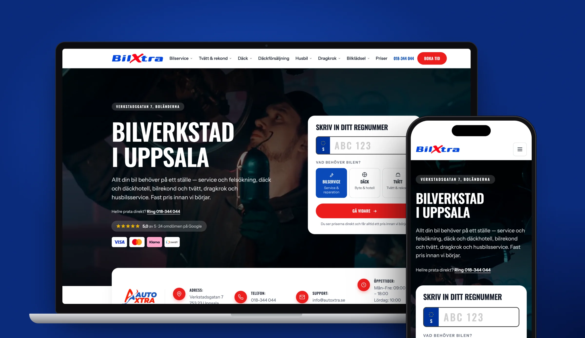

A landing page is a page built for a single purpose: to get the visitor to do one specific thing. Book an appointment, request a quote, download something, buy a product. Everything that doesn't serve that purpose should go.
That's the difference from a regular page on the website. A home page should help many different visitors on in different directions. A landing page should lead everyone in the same direction, and so it has no exits.
When you need one
- You are advertising. If you send ad traffic to the home page, you are burning money. The ad promised something specific; the page has to deliver exactly that.
- You are launching a single service and want to measure interest in isolation.
- You sell different things to different groups. One page per audience converts better than one page trying to speak to everyone.
- You are testing a new market or town.
You don't need one when the visitor is still getting their bearings. Then a regular, informative page is better.
The structure that works
The order below follows the order in which questions come up in the reader's head.
1. The headline: what and for whom
You have about three seconds. The headline should say what you offer and to whom, in plain language.
Works: "Roofing in Uppsala, finished within two weeks" Doesn't work: "We create sustainable solutions for the future"
If the visitor comes from an ad, the headline should contain the same words as the ad. If that thread breaks, the visitor doubts they have landed in the right place, and leaves.
2. The subheading: why you
One sentence giving the most important reason to keep reading. This is where the concrete belongs: "Fixed price, a ten-year guarantee, and we clean up after ourselves."
3. The call to action: visible straight away
The button should be visible without scrolling. Write what happens when you click: "Request a quote" or "Book a free visit", not "Send" or "Read more".
Repeat the call to action further down the page. Someone who is convinced after reading everything shouldn't have to scroll back up.
4. The proof: why believe you
Directly below, while the interest is there:
- Reviews with name, town and ideally a photo
- Number of completed jobs or years in the business
- Client logos, if you are allowed to show them
- Certifications, guarantees, insurance
A concrete review from a named person in the same situation as the reader is stronger than ten anonymous stars.
5. What you get
Describe the offer as outcomes, not features. Not "responsive design" but "works just as well on your phone as on your computer". Not "SEO-optimised" but "built to be found when your customers search".
A short bullet list beats a long paragraph.
6. The objections
List the questions that hold people back and answer them directly: What does it cost? How long does it take? What happens if I'm not happy? Are you insured? Do I have to sign up for a fixed term?
This section is the most underrated on the whole page. Every unanswered worry is a person who doesn't get in touch, and you never find out why.
7. The price, or an indication
Saying nothing about price is the most common reason someone leaves a service page. You don't need to publish a price list, but give a ballpark: "Projects normally start at around SEK 30,000."
It filters out the wrong enquiries and gives the right people the confidence to get in touch.
8. The form
Only ask for what you need to have a first conversation. Every extra field costs responses. Name, email or phone, and a free-text box are almost always enough.
Spell out what happens next: "We'll get back to you within a day." It removes the uncertainty about what you are committing to.
Need a new website? Read about web development →
Common mistakes
Menus and links everywhere. Every link away from the page is an exit. Remove the menu or cut it back sharply.
The ad and the page say different things. The ad promises a "free quote", the page talks about the company's history. The visitor backs out immediately.
It's all about you. "We were founded in 2015 and are passionate about quality." The visitor cares about their own problem.
Stock photos. Smiling people in meeting rooms signal that nothing here is real. A mediocre photo of your actual business is better.
Slow loading. Especially serious with ad traffic: you pay for the click and lose the visitor before the page appears. Read more in our guide to technical SEO.
No tracking. Without following up form submissions and phone taps, you don't know whether the page works.
Built for desktop. Most visits happen on mobile. Test on a real phone.
How long should the page be?
As long as it takes to answer the objections, and no longer.
A simple, cheap offer with low risk: a short page is enough. An expensive decision with a long commitment: a longer page is needed, because more questions have to be settled before anyone dares to go ahead.
Test it yourself: read the page as a sceptical customer and note every time you think "yes, but…". Each of those thoughts is a missing section.
Measure the right things
Follow three numbers:
- Conversion rate: the share of visitors who act
- Cost per conversion: for ad traffic, see how much Google Ads costs
- The quality of the enquiries: many poor leads are worse than a few good ones
The last number is often forgotten. A page that doubles the number of enquiries but only brings in people without a budget has made things worse, not better.
If you want a landing page that actually converts, get in touch. Also read our guide to conversion rate optimisation or see how we build fast websites that convert.
Frequently asked questions
What is a landing page?
A landing page is a web page built for a single goal: getting the visitor to take one specific action, such as requesting a quote or booking an appointment. Unlike a home page, it has no alternative routes onwards, because every extra link reduces the likelihood that the visitor does what you want.
How long should a landing page be?
As long as it takes to answer the visitor's objections. A simple, low-risk offer can make do with a short page, while an expensive decision with a long commitment needs more space to settle questions about price, time, guarantees and what happens if something goes wrong.
What is a good conversion rate for a landing page?
For a landing page with ad traffic, 5–15 per cent is within the normal range. If you are lower, there is usually something concrete missing: a price indication, trust signals, or the form is too long. Following your own progress matters more than comparing yourself with others.
Should a landing page have a menu?
No, or a heavily reduced one. Every link away from the page is an exit for the visitor. On landing pages with ad traffic, it usually pays to remove the menu entirely and keep only the logo and the call to action.
Sources
Need a new website?
Tell us what you have today. After a free review you get a fixed price in writing.